A reverse printed design with hand drawn type and a cool two-color break up. Reverse printing gives a nice subtle look to your t-shirt designs. If you want to know more about this type of screen printing technique (printing on the inside of the shirt) have a look at this recent post on reverse screen printing.

O'Neill T-Shirt Graphics
O'Neill is known as the Original American Surfing Company. It began as a wetsuit company and surf shop, founded by Jack O'Neill in 1952. It continues to be one of the most sought-after surf brands today.
Here's a compilation of some more recent t-shirt graphics.


Preparing T-Shirt Designs with Texture and Transparency for DTG Printing
If you are printing t-shirts Direct to Garment (DTG) with an online service like Spreadshirt, TeeSpring, or UberPrints here are some things to know when preparing your art files.
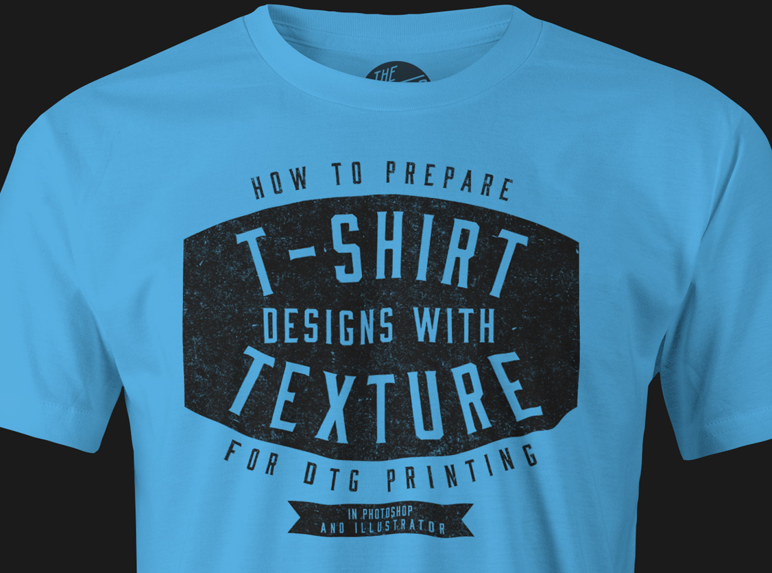
Unless your design is a solid rectangle of ink defined by the dimensions of your image file, it will best be prepared with a transparent background. An art file with transparency will also be required if your design has a distress texture (like Plastisol, Time Machine Textures, or Bitmap Textures) that knocks back to shirt fabric color. Otherwise, you may get back a t-shirt with printed ink texture.
Many of these companies accept only a few limited file types. The most universal solution is to send them a PNG file with a transparent background (and transparent texture). A transparent PNG can easily be exported out of Photoshop or Illustrator.
Method 1: Photoshop (Simple)
If you have a flattened one color image, here’s one way you can remove a white background color.
To knock distress texture through your design, the simplest method would be to erase the texture out of your design if you have any Photoshop Brush textures like the ones mentioned above. Just double click the brush files to load them into Photoshop. Select your eraser tool. Select one of the texture brushes from the brush panel. Size your brush using the [ ] bracket keys, and click to erase out the texture. Save your file as a PNG.
Method 2: Layered Photoshop File (Non-destructive technique)
If your Photoshop file is layered, you can group all the layers that you want textured. Highlight that layer group in your layers panel and go to Layer >> Layer Mask >> Reveal All. With that layer mask highlighted in your layers panel, simply paint in black with one of the texture brushes to knock texture through your design.
To see how this method works, skip ahead in this video to the 4:00 mark:
This method is good because using the layer mask makes it nondestructive to your art. Just hide the background layer (if there is one) and save a copy of your file as a PNG and upload it to your t-shirt print vendor.
Method 3: Illustrator Opacity Mask
If you have a background-less design in Illustrator, you will have no problem sending a vector file to be printed. However, if your design includes bitmap or vector textures that go back to t-shirt fabric color, then you will want to use this Opacity Mask method.
Export your art as a PNG anywhere between 150-300 DPI at the printed dimensions that you want. Your exported image will no longer be a vector file, but that's completely fine.
Tips:
- When you go File > Export, have the transparency box clicked so your textures become transparent to the background color.
- When you upload your files, make sure to add your desired dimensions in the notes. Even if, for example, your PNG file is saved as 11" x 6" @ 300 DPI, it doesn't mean the person printing your image will know to print it 11" x 6" on the shirt. I've have found that unless you specify, your t-shirt design will often come back bigger or smaller than you wanted.
- While you are at it, you might as well specify the placement of your graphic on the shirt. For instance, you could include a note that says "Please place graphic 3.75" beneath collar seam."
Reverse Screen Printing
Otherwise known as a "push through," a reverse print is when you flip a t-shirt inside out, and print on the inside of the shirt. Some of the ink shows through on the other side, and it results in a natural texture determined by the qualities of the fabric.
You can achieve different looks, depending on the color and thickness of your t-shirt fabric, the color and type of ink, and also how much squeegee pressure is applied.
These are some Quiksilver tees that I spotted out in the store the other day. Notice how the bottom left design used more ink & squeegee pressure for a different effect than the others. On dark shirts, you will typically need more ink and pressure for your graphic to show through, compared to a light t-shirt.
You can reverse print with waterbase ink or plastisol ink. I've even seen reverse printing done with discharge.
Most often, you will want to use water based ink because it will have a softer feel than plastisol ink. Remember, the ink is printed on the inside of the shirt so a softer print is better!
The Ford Bronco is a graphic I reverse screen printed (hand-pulled) in my studio using plastisol ink on a 100% cotton shirt. You can see that more squeegee pressure was applied at the bottom of the graphic versus the top, resulting in a higher density of ink.
You can also print a reverse print with multiple colors. Here's a three-color 4th of July design we made at O'Neill. Reverse printing is good for graphics that would otherwise be too bold if printed normally. The reverse printing "knocks back" the design a bit and makes it more subtle.
Having a more subtle print is also good with men's floral prints. A t-shirt that would otherwise be more appropriate for a pool party, now is turned into a t-shirt you can wear any day of the week.
Why limit yourself to just printing on the inside of the shirt? This was a two-sided print we did at O'Neill.
The palm leaves were reverse printed. Next, the ink was cured. However, I'm not sure if it was put through a dryer or flash-cured on the press (Either method should work).
After that, the t-shirt was flipped back from being inside out, and then reloaded onto the press. Lastly, the O'Neill letters and frame were screened on top.
If you want to screen print on the inside and the outside of the shirt, it needs to be a design that does not require critical registration. You can see the if the O'Neill letters and frame were to float 1/8" in any direction, it would not ruin the design.
Flow-Tech Lettering
From the pages of Rin Tanaka's My Freedamn 2 book is one of my all time favorite examples of a vintage surf t-shirt graphic.
It doesn't abide by the normal rules of classic lettering or type design. There's not much structure. But what it does have is lots of FLOW.
There's no mention of who the artist is. But since it's such a vintage design, it is certain that no computers or fancy design software were involved in it's creation.
Computers allow us to create art in perfect alignment and proportion. Let's not forget to take out the pencils, paper, x-acto knives, ink, and spray paint every once in a while to make sure that we keep the flow.

Printing One Color T-Shirt Designs
I picked up this vintage Jim Morrison t-shirt (black shirt, white ink - top image) at the Rose Bowl Flea Market on Sunday.
The bottom image (white shirt, black ink) has been inverted in Photoshop, and it's a lot more obvious that it's Jim.
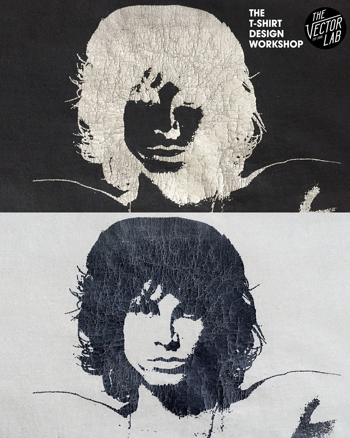
This is a good example of something you will encounter when printing one-color images that were originally designed to be printed with dark ink on light t-shirts. When you are printing one-color photos of faces, cars, etc onto tees sometimes you will get an "x-ray" or uplit look when you try printing that design with light ink on a dark t-shirt.
If you wanted to fix the x-ray problem, you would need to make a new color separation setup for the dark shirts in Photoshop so that the highlight areas of the design (Jim's face) are lighter than the shaded areas of the photo. Essentially, in Photoshop you could create a "baseplate" layer underneath the existing screen, and change the existing ink layer to knock out to shirt color.
But in this case, I think it makes the t-shirt look more vintage and unique.
The cracks in the plastisol ink also add another layer of charm.
By the way, if you are looking to add vintage looking t-shirt ink cracks to your designs, I have some Photoshop and Illustrator textures for t-shirt designers here called Plastisol.

T-Shirt Design Workshop 01: Foundation
The T-Shirt Design Workshop has just been posted!
If you have ever wanted to learn more about T-Shirt Design, this is a must-see workshop. It covers all the elements that go into designing a t-shirt. These are things that took me 15 years of working with surf apparel and various screen printers to learn.
Go here to find out all the details about T-Shirt Design Workshop 01: Foundation.
T-Shirt Design Workshop
My next online class, the T-Shirt Design Workshop, is almost ready!
(Update, April 12, 2016: The wait is over! Go here to find out all the details about the T-Shirt Design Workshop 01: Foundation.)
